- Seaborn - Home
- Seaborn - Introduction
- Seaborn - Environment Setup
- Importing Datasets and Libraries
- Seaborn - Figure Aesthetic
- Seaborn- Color Palette
- Seaborn - Histogram
- Seaborn - Kernel Density Estimates
- Seaborn - Visualizing Pairwise Relationship
- Seaborn - Plotting Categorical Data
- Distribution of Observations
- Seaborn - Statistical Estimation
- Seaborn - Plotting Wide Form Data
- Seaborn - Multi Panel Categorical Plots
- Seaborn - Linear Relationships
- Seaborn - Facet Grid
- Seaborn - Pair Grid
- Seaborn Function Reference
- Seaborn - Function Reference
- Relational Plots
- Distribution Plots
- Categorial plots
- Regression plots
- Matrix Plots
- Multi plot grids
- Themeing
- Color Palettes
- Palette widgets
- Utility Functions
- Seaborn Useful Resources
- Seaborn - Quick Guide
- Seaborn - cheatsheet
- Seaborn - Useful Resources
- Seaborn - Discussion
Seaborn - Figure Aesthetic
Visualizing data is one step and further making the visualized data more pleasing is another step. Visualization plays a vital role in communicating quantitative insights to an audience to catch their attention.
Aesthetics means a set of principles concerned with the nature and appreciation of beauty, especially in art. Visualization is an art of representing data in effective and easiest possible way.
Example - Using Matplotlib
Matplotlib library highly supports customization, but knowing what settings to tweak to achieve an attractive and anticipated plot is what one should be aware of to make use of it. Unlike Matplotlib, Seaborn comes packed with customized themes and a high-level interface for customizing and controlling the look of Matplotlib figures.
main.py
import numpy as np
from matplotlib import pyplot as plt
def sinplot(flip = 1):
   x = np.linspace(0, 14, 100)
   for i in range(1, 5):
      plt.plot(x, np.sin(x + i * .5) * (7 - i) * flip)
sinplot()
plt.show()
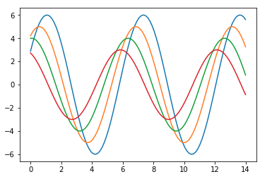
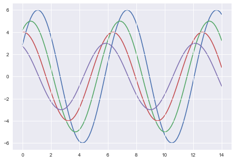
Output
This is how a plot looks with the defaults Matplotlib −
Example - Using Seaborn
To change the same plot to Seaborn defaults, use the set() function −
main.py
import numpy as np
from matplotlib import pyplot as plt
def sinplot(flip = 1):
   x = np.linspace(0, 14, 100)
   for i in range(1, 5):
      plt.plot(x, np.sin(x + i * .5) * (7 - i) * flip)
import seaborn as sb
sb.set()
sinplot()
plt.show()
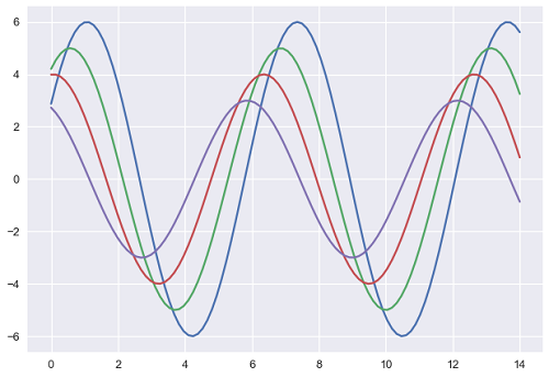
Output
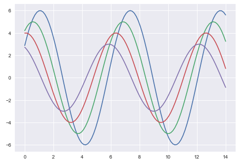
The above two figures show the difference in the default Matplotlib and Seaborn plots. The representation of data is same, but the representation style varies in both.
Basically, Seaborn splits the Matplotlib parameters into two groups−
Plot styles
Plot scale
Seaborn Figure Styles
The interface for manipulating the styles is set_style(). Using this function you can set the theme of the plot. As per the latest updated version, below are the five themes available.
Darkgrid
Whitegrid
Dark
White
Ticks
Let us try applying a theme from the above-mentioned list. The default theme of the plot will be darkgrid which we have seen in the previous example.
main.py
import numpy as np
from matplotlib import pyplot as plt
def sinplot(flip=1):
   x = np.linspace(0, 14, 100)
   for i in range(1, 5):
      plt.plot(x, np.sin(x + i * .5) * (7 - i) * flip)
import seaborn as sb
sb.set_style("whitegrid")
sinplot()
plt.show()
Output
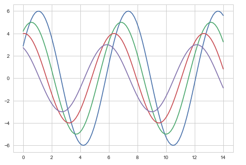
The difference between the above two plots is the background color
Example - Removing Axes Spines
In the white and ticks themes, we can remove the top and right axis spines using the despine() function.
main.py
import numpy as np
from matplotlib import pyplot as plt
def sinplot(flip=1):
   x = np.linspace(0, 14, 100)
   for i in range(1, 5):
      plt.plot(x, np.sin(x + i * .5) * (7 - i) * flip)
import seaborn as sb
sb.set_style("white")
sinplot()
sb.despine()
plt.show()
Output
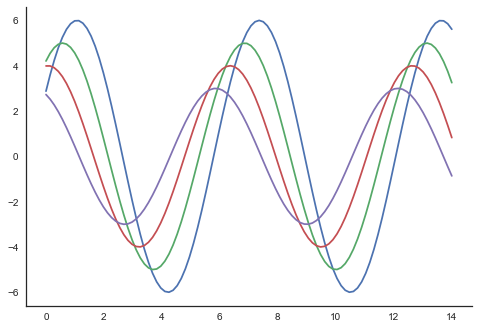
In the regular plots, we use left and bottom axes only. Using the despine() function, we can avoid the unnecessary right and top axes spines, which is not supported in Matplotlib.
Overriding the Elements
If you want to customize the Seaborn styles, you can pass a dictionary of parameters to the set_style() function. Parameters available are viewed using axes_style() function.
main.py
import seaborn as sb
print sb.axes_style
Output
{'axes.axisbelow'     : False,
'axes.edgecolor'      : 'white',
'axes.facecolor'      : '#EAEAF2',
'axes.grid'           : True,
'axes.labelcolor'     : '.15',
'axes.linewidth'      : 0.0,
'figure.facecolor'    : 'white',
'font.family'         : [u'sans-serif'],
'font.sans-serif'     : [u'Arial', u'Liberation
                        Sans', u'Bitstream Vera Sans', u'sans-serif'],
'grid.color'          : 'white',
'grid.linestyle'      : u'-',
'image.cmap'          : u'Greys',
'legend.frameon'      : False,
'legend.numpoints'    : 1,
'legend.scatterpoints': 1,
'lines.solid_capstyle': u'round',
'text.color'          : '.15',
'xtick.color'         : '.15',
'xtick.direction'     : u'out',
'xtick.major.size'    : 0.0,
'xtick.minor.size'    : 0.0,
'ytick.color'         : '.15',
'ytick.direction'     : u'out',
'ytick.major.size'    : 0.0,
'ytick.minor.size'    : 0.0}
Example - Changing Plot Style
Altering the values of any of the parameter will alter the plot style.
main.py
import numpy as np
from matplotlib import pyplot as plt
def sinplot(flip=1):
   x = np.linspace(0, 14, 100)
   for i in range(1, 5):
      plt.plot(x, np.sin(x + i * .5) * (7 - i) * flip)
import seaborn as sb
sb.set_style("darkgrid", {'axes.axisbelow': False})
sinplot()
sb.despine()
plt.show()
Output
Scaling Plot Elements
We also have control on the plot elements and can control the scale of plot using the set_context() function. We have four preset templates for contexts, based on relative size, the contexts are named as follows
Paper
Notebook
Talk
Poster
By default, context is set to notebook; and was used in the plots above.
main.py
import numpy as np
from matplotlib import pyplot as plt
def sinplot(flip = 1):
   x = np.linspace(0, 14, 100)
   for i in range(1, 5):
      plt.plot(x, np.sin(x + i * .5) * (7 - i) * flip)
import seaborn as sb
sb.set_style("darkgrid", {'axes.axisbelow': False})
sinplot()
sb.despine()
plt.show()
Output
The output size of the actual plot is bigger in size when compared to the above plots.
Note − Due to scaling of images on our web page, you might miss the actual difference in our example plots.