- Seaborn - Home
- Seaborn - Introduction
- Seaborn - Environment Setup
- Importing Datasets and Libraries
- Seaborn - Figure Aesthetic
- Seaborn- Color Palette
- Seaborn - Histogram
- Seaborn - Kernel Density Estimates
- Seaborn - Visualizing Pairwise Relationship
- Seaborn - Plotting Categorical Data
- Distribution of Observations
- Seaborn - Statistical Estimation
- Seaborn - Plotting Wide Form Data
- Seaborn - Multi Panel Categorical Plots
- Seaborn - Linear Relationships
- Seaborn - Facet Grid
- Seaborn - Pair Grid
- Seaborn Function Reference
- Seaborn - Function Reference
- Relational Plots
- Distribution Plots
- Categorial plots
- Regression plots
- Matrix Plots
- Multi plot grids
- Themeing
- Color Palettes
- Palette widgets
- Utility Functions
- Seaborn Useful Resources
- Seaborn - Quick Guide
- Seaborn - cheatsheet
- Seaborn - Useful Resources
- Seaborn - Discussion
Selected Reading
Seaborn - Histogram
Histograms represent the data distribution by forming bins along the range of the data and then drawing bars to show the number of observations that fall in each bin.
Seaborn comes with some datasets and we have used few datasets in our previous chapters. We have learnt how to load the dataset and how to lookup the list of available datasets.
Seaborn comes with some datasets and we have used few datasets in our previous chapters. We have learnt how to load the dataset and how to lookup the list of available datasets.
Example - Plotting Histogram
main.py
import pandas as pd
import seaborn as sb
from matplotlib import pyplot as plt
df = sb.load_dataset('iris')
sb.distplot(df['petal_length'],kde = False)
plt.show()
Output
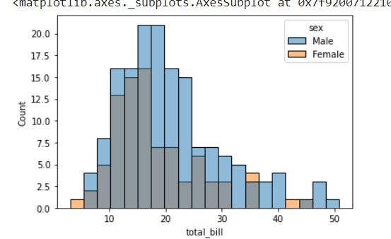
Here, kde flag is set to False. As a result, the representation of the kernel estimation plot will be removed and only histogram is plotted.

Advertisements
8